Beverage Brand Adds $140k in Monthly Incremental Revenue
Crio Bru is a beverage brand that sells cacao based products, helping customers quit coffee or just add a new drink to their repertoire. Let’s check out how we helped them add $140k in monthly revenue to their business through Conversion Revenue Optimization and split-testing!
Food and beverage is one of the most competitive, difficult industries to grow an e-commerce brand in.
Businesses in this industry need every advantage they can get to make sure that they’re able to grow while hitting profitability goals.
One of the best ways to do that is through improving efficiency of the current traffic that comes to your site. Basically, making more people who come to your site purchase.
Split-testing is the key component to iteratively finding those wins. What we’ve done here is put together a breakdown of the 3 most impactful split-tests we’ve run for Crio Bru, along with analysis.
Let’s get into it!
Here are the tests we’ll look at
- Higher Priced Bundle on PDP
- Checkout banner
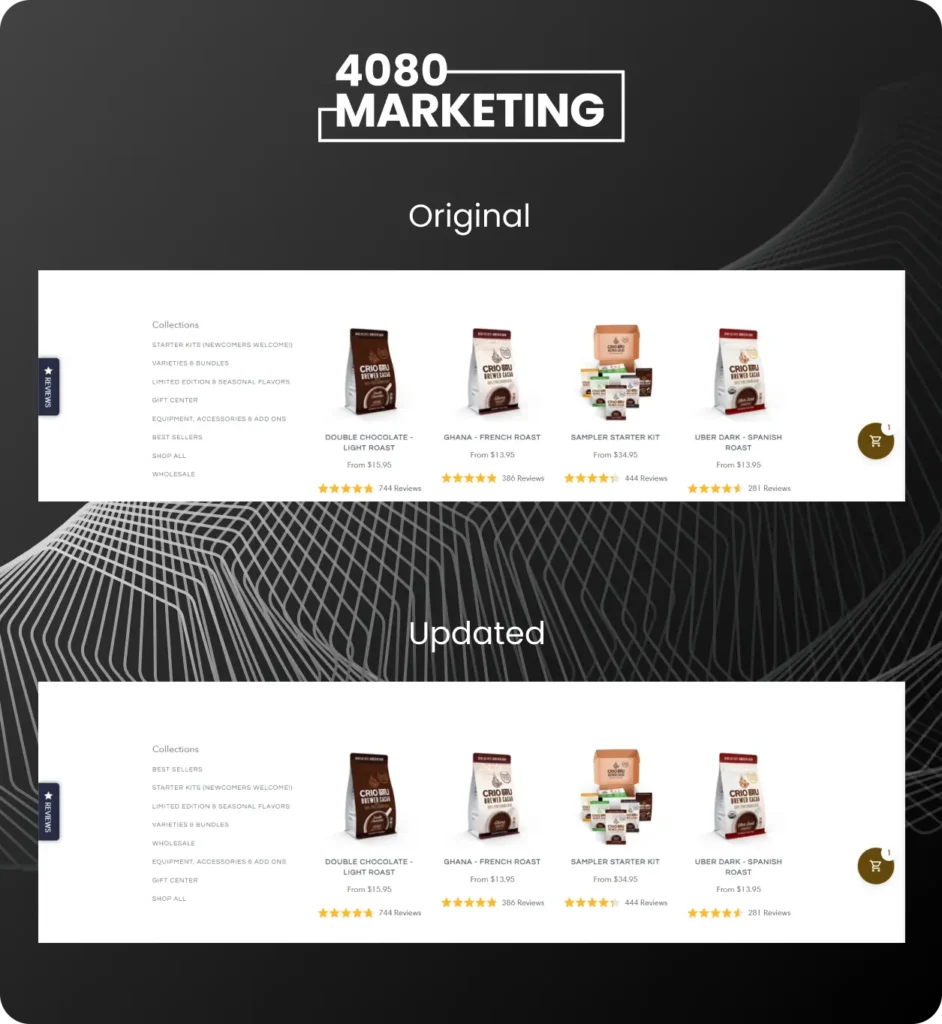
- Collection page filter reorder

Higher Priced Bundle on PDP
One of the main tenets of our Conversion Revenue Optimization process is to increase conversion rate while increasing average order value at the same time. Proper upselling is one of the best ways to do that.
In this test, we included a bundle on product pages that goes well with the main product, and we inserted it below trust badges lower down on the page.
Now, you shouldn’t just slap a bundle on your page, say “also want this?” and call it a day. That’s lazy marketing. You need to highlight why they should also buy it. What’s the benefit they’ll get by buying this too (faster results, better results, more guaranteed results, a better outcome, etc.) We added a headline above the bundle: “Want To Really Kickstart Your Morning Routine?” This provides context for why we’re even making the offer, and complements one of the main reasons customers buy: to change-up their morning routine.
Checkout Trust Banner
You might begin to see a pattern here if you’ve read any of our other case studies!
Doing everything we can to not lose sales at checkout is critical. You’ve worked so hard to get a user to the point of checking out. Think of how many steps they’ve had to take to get here: seeing an ad, clicking an ad. Maybe entering their email to get on your list. Seeing retargeting ads, getting email sequences, coming back to the site, adding products to their cart, and, finally they’re about to add in their payment details. Losing them here is devastating.
We need to make sure to do everything we can to push a sale across then line and handle objections.
In this case, we utilize empty space at the top of the checkout to include a graphic that handles two last minute objections – shipping cost and the return policy.
Using otherwise wasted space for trust building is one of the smartest things you can do to increase your conversion rate.


Collection Page Filter Reorder
This is a UX-type test. When people are on collections pages, they are in shopping mode. They are looking at your product catalog, seeing what options are available.
In this case, the order of options that the Filter button had was not very well-thought out. User’s are so distracted and have such a short amount of patience that any annoyance can cause them to bounce from the site.
So, we re-ordered the filters on the collection page to put the bestsellers as the first option. We want to make sure that we are giving the user the easiest possible path to seeing our best products.
Being able to put yourself in the buyer’s shoes is paramount. When you think like a buyer of your product, you’ll see your site with fresh eyes and be able to spot inefficiencies easier.
Conclusion
These plus roughly 10 more winning tests all combined to add $140k over the course of 6 months of working together.
Conversion Revenue Optimization isn’t a destination, it’s a process. You never have your “most optimized site.”
There is always a better headline, always a better copywriting angle, always a better design. The point is that you continually test to try to get as close as you can to that unreachable destination.
Make sure that you are split-testing changes you make to your site! Just because it worked for someone else doesn’t mean it will work for you.
Want to see how much Incremental Revenue we could potentially help you drive through working with us through our Conversion Revenue Optimization process?
Book a call with us below and we’ll give you 3 split-tests that we’d run for your brand along with the highest impact changes to make on your site.


