We Helped this Subscription Letter Company Add $294k in additional Quarterly Revenue
We helped The Flower Letters, a subscription business that tells stories through letters, improve their conversion rate and add $294k in additional quarterly revenue.
Throughout over 6 months of rigorous testing, we’ve had quite a few wins. But we’ve compiled 3 of the most impactful ones here.
Now there’s one added caveat with the results for this business – it’s a subscription business! For subscription business, the wins from split-testing are compounded.
If you have a $9 per month product with a 20 month average retention, each additional purchase doesn’t add $9… it adds $180 in revenue per additional purchase.
So if your business has a recurring revenue model, you’ll want to take these tests even more to heart.
With all that being said, let’s look at the top 3 split-tests that produced over $294k in incremental revenue:
- Homepage above the fold
- Announcement Bar
- Checkout trust banner
Let’s go through each and analyze.

Homepage above the Fold
This almost always is a winner with every client we work with. Usually, homepages are often ignored and not built to convert traffic. However, that’s a grave error.
The before for the Flower Letters assumed that someone was already very familiar with them – if you just landed on this page from an ad, you still don’t really know what the company does. That’s a problem.
The key with homepage above the fold sections is to include a headline that explains the big promise your product delivers, include social proof, and an image that shows the experience of your product.
In this case, we redid the whole thing to make that happen.
Announcement Banner
You need to make sure you are treating every highly-viewed element of your site as an opportunity to move people along the buyer’s journey.
Your announcement bar is one of the best places to do that. It’s seen by nearly everyone that comes to the site, it’s present on every page, and it’s attention grabbing.
If you have a sale going on, highlight that. If not, utilize the opportunity to pre-handle objections. In this case, we included that shipping is free and fast and we highlighted the 30 day money back guarantee. Just as important, we made the bar clickable and changed the destination to the best selling product page. Combined, they proved to be a winning change.


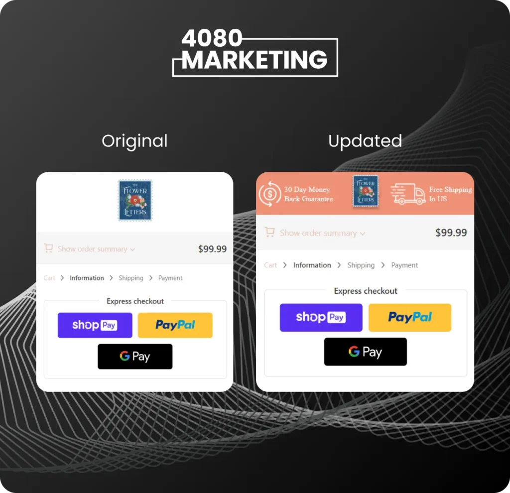
Checkout Trust Banner
This is one of those tests that take very little time to implement, but can produce extremely outsized returns.
Think about it like this – every single buyer needs to go through your checkout process. If you have 50% checkout abandonment and can get it down to 40%, you’ve just increased the amount of purchases your entire store gets by 20%. That’s TWENTY PERCENT more revenue without having to spend a single penny more.
For this test, we just change the image on the checkout page to handle any last minute objections. When someone gets to checkout, that’s when the purchase gets “real” in their mind. So, some last minute doubts/concerns can creep in.
In this case, we highlighted the 30 day money back guarantee and free shipping again. You’ll notice we are often highlighting the same benefits – that’s because we know what customers care about!
By the way, this can be done even if you’re not on Shopify Plus.
Conclusion
Building a system that allows you to split-test the most important elements of your site to increase conversion rate is one of the highest ROI activities you can do in your business.
How much traffic do you think you’re potentially wasting? 5%? 10%? More? That percentage is directly tied to the amount of customers, revenue, and profit you are losing out on.
So, hopefully these tests are helpful to you and provide inspiration. DO NOT just take the wording and tests verbatim – you need to take the principles from the tests and make sure to apply them to what your customers care about.
Additionally, make sure you split-test changes before you make them live on site. You want to be reasonably certain that changes you make will lead to a significant lift in performance. (and no, a gut feeling is not data).
Want to see how much Incremental Revenue we could potentially help you drive through working with us through our Conversion Revenue Optimization process?
Then book a call with us below and we’ll give you an immediate gameplan and site audit!


